WHAT IS
Share on:


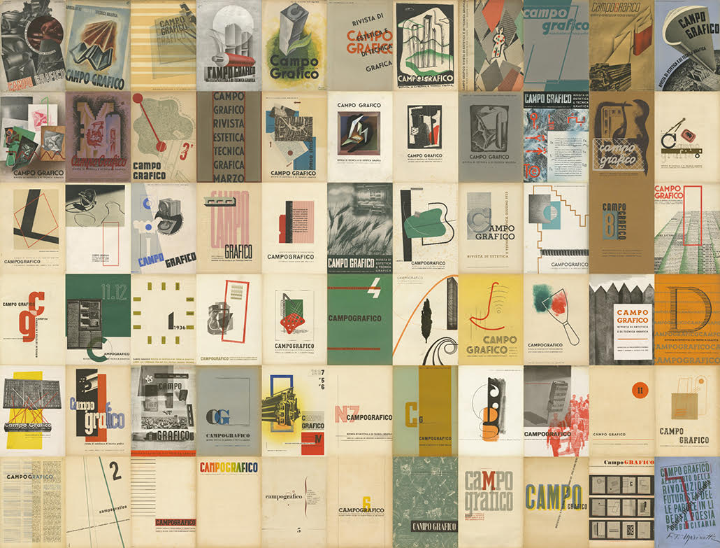
CAMPO GRAFICO - Rivista di estetica e di tecnica graica, fu a Milano tra le due guerre la più originale impresa collettiva in quelli che retrospettivamente furono definiti gli anni "creativi", quando alla Galleria Il Milione o al Bar Craja si moltiplicavano i fermenti del gusto moderno, passando dalle discussioni e le mostre sulla pittura astratta, al dibattito sul destino dell’architettura fino alla nuova tipografia, presentata nella Sezione Grafica della Germania 1933 alla V Triennale e simboleggiata dal carattere Futura di Paul Renner.
La Rivista divenne subito anche un ideale punto di aggregazione di spiriti liberi e indipendenti, molti dei quali restati storicamente nel più assoluto anonimato. Qualunque fosse la loro formazione, tecnica e/o artistica, erano menti aperte agli stimoli intellettuali che avevano caratterizzato le avanguardie europee nell’ultimo decennio.
Come ebbe a ricordare cinquant'anni dopo Attilio Rossi (in Carlo Dradi, Millenovecentotrentratre: nasce a Milano la grafica moderna, Comune di Milano, 1973, pag. 13), erano le esperienze e «gli insegnamenti della Bauhaus, le stimolanti lezioni de "L’Esprit Nouvau", di Ozenfant e Jeanneret, e di "Ornamento e delitto", il famoso saggio di Adolf Loos, nonché l’architettura di Gropius, Le Corbusier e il movimento razionalista, i maestri dell’arte (Klee, Kandinskij, Picasso, ecc.), senza dimenticare le nuove frontiere della musica moderna (Malipiero, Stravinskij)» che confluivano programmaticamente in una rivista sperimentale di arti grafiche totalmente nuova.
In mancanza di fonti archivistiche, a fornirci preziose informazioni storiche sull'impresa di "Campo Grafico" sono state soprattutto le testimonianze di due dei suoi direttori e fondatori, Attilio Rossi e Carlo Dradi, personalità capaci nel dopoguerra di riannodare i fili di quella eccezionale esperienza fondando il Centro di Studi Grafici di Milano (oggi Associazione Culturale Studi Grafici) e la rivista "Linea Grafica".
L’avventura cominciò nel 1932 in una trattoria di Via delle Asole a Milano, dove si riuniva periodicamente il nucleo dei fondatori. C’era l’esigenza di un profondo svecchiamento delle arti grafiche: dal punto di vista tecnico si voleva portare la qualità tipografica all’altezza della fotografia; sul piano estetico occorreva superare gli ormai angusti e inadeguati limiti delle simmetrie neoclassiche e della tipografia come arte, tradizionale cavallo di battaglia del "Il Risorgimento Grafico" di Raffaello Bertieri; infine, culturalmente, l’innovazione poteva nascere solo dalla contaminazione tra la tipografia, l’architettura razionale e le avanguardie artistiche europee.
Finalmente si potevano dibattere gli argomenti della nuova estetica grafica che Guido Modiano e Edoardo Persico avevano anticipato sulla rivista "Tipografia" tra il 1931 e il 1932, ma anche l’identità e il ruolo della nuova figura professionale del "progettista grafico", passando necessariamente attraverso un profondo rinnovamento dei programmi di insegnamento nelle scuole professionali.
Il miracolo fu possibile grazie all’opera gratuita e volontaria di addetti ai lavori (tipografi, compositori, litografi, linotipisti, fototipisti e grafici) e alla ospitalità – ma in orario festivo – di alcune tipografie.
Appoggiavano l’impresa anche diversi amici sostenitori provenienti da altri ambiti, tra questi fin dalla fondazione c'era Giovanni Ferro, il quale racconta (Milano Capitale dell’antifascismo, Milano, Mursia, 1985, pp. 133) come nello Studio Dradi-Rossi in via Rugabella 34 a Milano (presso cui dal 1934 era ospitata la sede della rivista) – dove convenivano ogni sera tipografi, grafici, pittori, scenografi, scultori, architetti, superando di fatto la distinzione tra lavoro manuale e lavoro intellettuale e le barriere di classe – si misurassero «i valori artistici, umani e politici con una serietà, uno spirito critico e un’aderenza alla realtà che normalmente si verifica soltanto dopo una rivoluzione politica e sociale».
Solo recentemente, grazie all’incrocio di più testimonianze e ricordi, si è riusciti a ricostruire quale fu la reale tiratura complessiva della rivista: 500 copie vendute in abbonamento ai sostenitori e ai tipografi.
Oltre alla pubblicità e agli articoli, la rivista conteneva spesso anche inserti e allegati fuori testo, dove figuravano applicati vari stampati, come: copertine di libri, carte da lettere, biglietti d’auguri, avvisi di chiusura per ferie, manifesti, pieghevoli, cartoline, progetti grafici degli allievi delle scuole, annunci, listini… alcuni dei quali inseriti sciolti nei fascicoli e che purtroppo sono andati perlopiù perduti.
Le raccolte complete dei 66 numeri pubblicati, a quanto ci risulta, si contano sulle dita di una mano. Gli inserti fuori foliazione erano lavori tipografici autonomi delle tipografie, stampati pubblicitari per vari committenti oppure saggi delle esercitazioni grafiche delle scuole.
I numeri di Campo Grafico
- 66 fascicoli;
- 500 copie tirate;
- 4 cambi sede;
- 9 stampatori;
- 1650 pagine;
- 54 tavole fuori testo;
- 114 inserti applicati a mano;
- 23 le firme delle copertine;
- 21 le firme dei collaboratori.
________________________________________________________________
CAMPO GRAFICO - Aesthetic and technical graphic design journal, it was between the two wars in Milan the most original collective company in those that in retrospect they were defined “creative” years, when at Galleria Il Milione or at the Bar Craja the ferments of modern taste multiplied, passing through from discussions and the exhibitions on abstract painting, to the debate on the fate of architecture up to the new typography, presented in “Sezione Grafica of Germany” at the V Triennale and symbolized by the Futura of Paul Renner typeface.
The journal immediately became an ideal aggregation point for indipendent and free spirits, many of which historically remained in absolute anonymity. Whatever their training, technical and / or artistic, they were open minds to the intellectual incitement that had characterized the European avant-gardes in the last decade.
As he recalled fifty years later, Attilio Rossi (1933 in Carlo Dradi: In Milan borns the modern graphic, Milan district, 1973, pag. 13), were the experiences and "the teachings of the Bauhaus, the stimulating lessons of" L'Esprit Nouvau ", of Ozenfant and Jeanneret, and of Ornamento e delitto, the famous essay of Adolf Loos”, and also Gropius architecture, the rationalist movement of Le Corbusier, the masters of art ( Klee, Kandinskij, Picasso, ecc.), without forget the new frontiers of modern music (Malipiero, Stravinskij) that flowed programmatically into an entirely new experimental graphic arts journal.
In the absence of archival sources, to providing us with valuable historical information on the company of “Campo Grafico” they were above all the testimonies of two of its directors and founders, Attilio Rossi and Carlo Dradi, personality that in the postwar period were able to knot again the threads of that extraordinary experience founding the “Centro di Studi Grafici di Milano” (today called 'Associazione Culturale Studi Grafici') and “Linea Grafica” the magazine.
The adventure began in 1932 in a trattoria in Via delle Asole in Milan, were the core of the founders met periodically.
There were a deep necessity of rejuvenation of graphic arts: from a technical point of view there were the intention to bring typographical quality at the photography greatness; in the aesthetic level it was necessary to overcome the now narrow and inadequate limits of neoclassical symmetries and typography as art, traditional battle horse of Raffaello Bertieri “Risorgimento Grafico”; lastly, culturally, the innovation could only come from the contamination between typography, rational architecture and the European artistic avant-garde.
Finally the arguments of the new graphic aesthetics that Guido Modiano and Edoardo Persico had anticipadet in the magazine “tipografia” between 1931 and 1932 could be discussed, but even the identity and the role of the new professional figure of “progettista grafico”, necessarrily passing through a deep transformation of teaching programs in professional schools.
The miracle was possible thanks to the free and voluntary and ospitality work of insiders (typographers, composers, lithographers, linotypers, fototipisti and graphics) - but on public holidays - some typographies.
Supporters also supported various friends from other areas, since the constitution between these there was Giovanni Ferro, who tell ( Milano Capitale dell’antifascismo, Milano, Mursia, 1985, pp. 133) like in the Dradi- Rossi Studio in Via Rugabella 34 in Milan (where the headquarters of the magazine was housed since 1934) – were every night agreed typographers, graphics, painters, scenographers, sculptors, architects, overcoming the distinction between manual labor and intellectual work and class barriers - we measured "artistic, human and political values with a seriousness, a critical spirit and adherence to reality that normally occurs only after a political and social revolution".
Only recently, thanks to the intersection of many testimony and memories, it was possible to reconstruct what was the real overall circulation of the magazine: 500 copies sold as a subscription to supporters and printers.
In addition to advertising and articles, the magazine also often contained inserts and attachments out of text, where they appeared applied various printed, as: book covers, writing papers, greeting cards, closing notice for holidays, posters, folding, postcards, graphic projects of school students, announcements, price lists… some of them inserted loose in the files and which unfortunately have mostly been lost.
The published 66 number complete collection, as far as we know, they are counted on the fingers of one hand. The inserts out of foliation were indipendent typographic works of typographies, printed advertising for various clients or essays of the graphic tutorials of the schools.
Campo Grafico in numbers:
- 66 journals;
- 500 print run;
- 4 changes of offices;
- 9 printers;
- 1650 pages;
- 54 inserted prints;
- 114 tipped in inserts;
- 23 cover designers;
- 21 contributors.
________________________________________________________________
SERVIZIO
L’Associazione Campo Grafico può fornire le immagini pubblicate in alta risoluzione e consentire l'utilizzo del testo contenuto nel sito a seguito di un relativo contributo.
Per informazioni e richieste scrivere a: info[at]campografico.org
SERVICE
The Campo Grafico Association may provide the published high-resolution images and allow the use of the text contained in the website after a contribution.
For information and requests write to: info[at]campografico.org
Share on:
